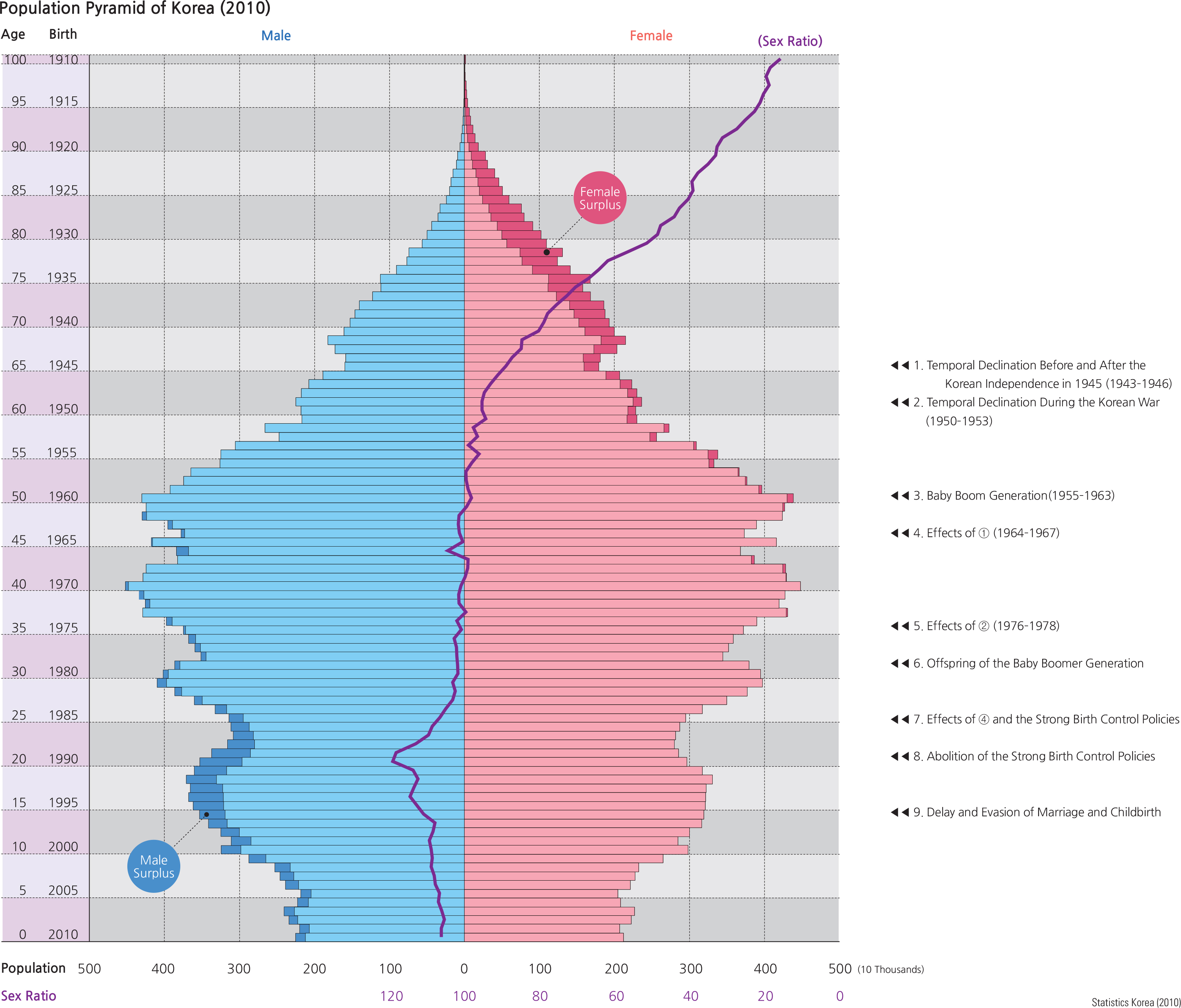
The 2010 population pyramid shows the population structure of South Korea by gender and age. The newborn population temporarily declined during the Korean independence movement in 1945 and the Korean War (1950–953). The baby boom generation (born between 1955 and 1963) has played a key role in determining the population structure. The birth rate declined slightly between 1964 and 1967 because of a relatively small population of childbearing age individuals due to the unstable period of Korean independence. The birth rate declined again between 1976 and 1978 because of a relatively small population of childbearing age persons born during the Korean War.
Birth rates increased in the early 1980s as the baby boomer generation began having children. The population born between 1985 and 1990 decreased substantially because they were the offspring of the generation born between 1964 and 1967, and strong birth control policies were enforced during this period. Although the number of new births increased slightly after governmental birth control policies were abolished, birth rates have decreased due to people waiting longer to marry and choosing not to have children.
The total population of Korea was approximately 49.4 million in 2010. If the current trend continues, it is expected to peak at approximately 52.2 million in 2030, and decline thereafter. Estimating future trends in population growth or decline is normally studied by the fertility rate of a country, which records the number of live births per thousand women of standard child-bearing age between 15 and 44. The Korean government has encouraged people to have children since 2000, but the fertility rate has fallen to one of the lowest in the world due to social and economic circumstances. Korea faces significant challenges associated with a stagnant or declining future population that can ultimately reduce the labor force age groups in the future.
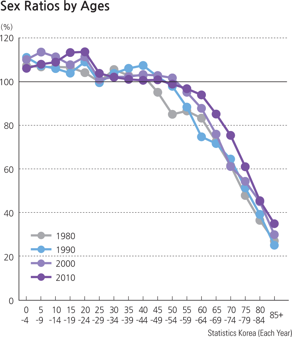
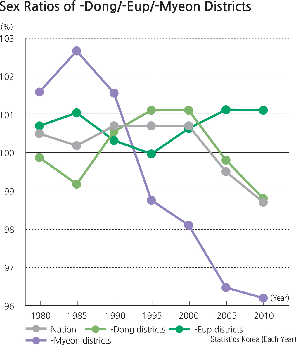
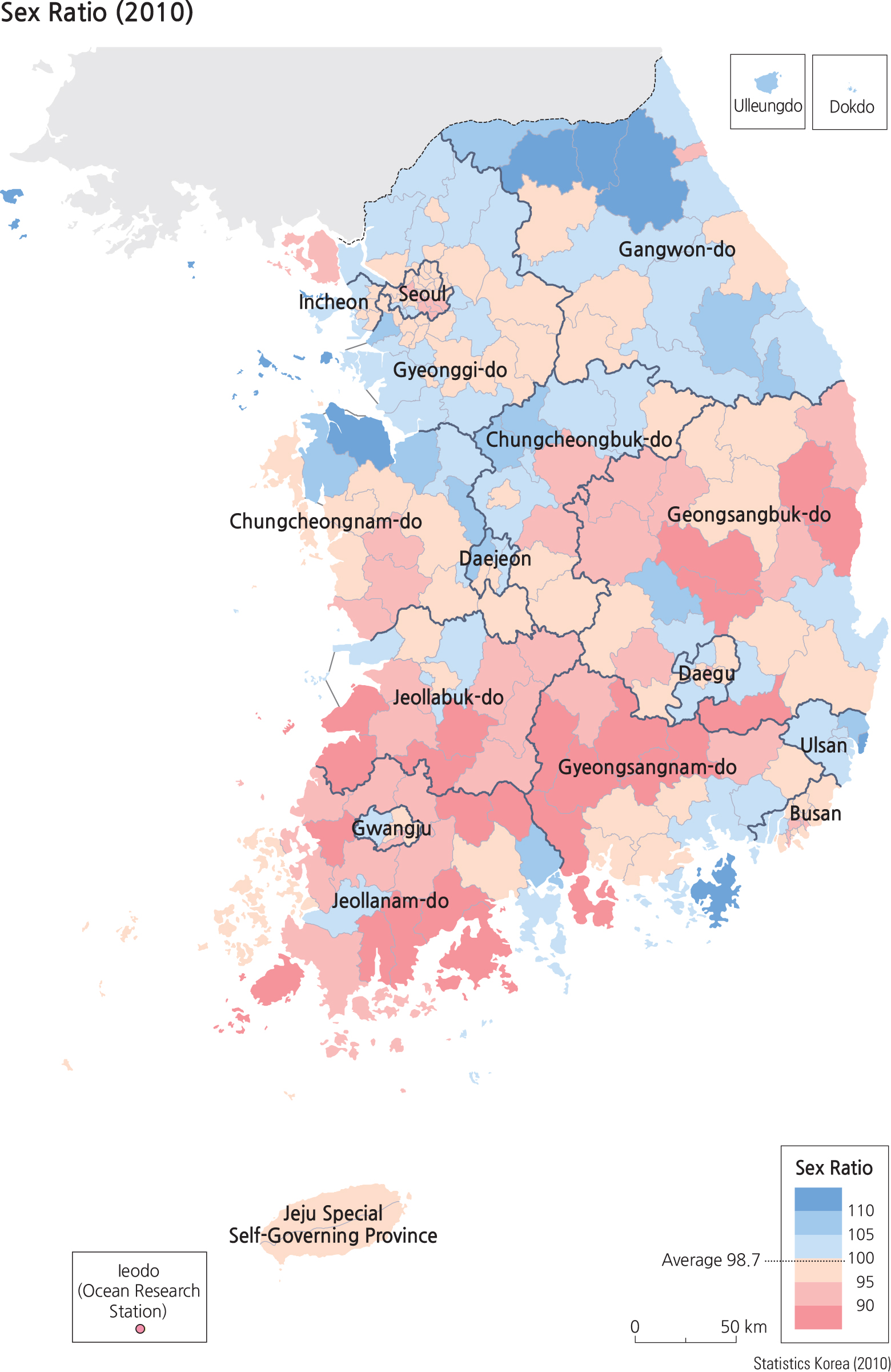
The sex ratio (number of males per 100 females) in 2010 of the total Korean population is 98.7, indicating that females outnumber males overall. The sex ratio (i.e., number of males per 100 females) indicates that males outnumber females in the population under 35 years old, while females outnumber males in the population over 60 years old. The sex ratio map displays that the areas with lower ratios (i.e., the areas with more females) are often -gun districts that are losing population.
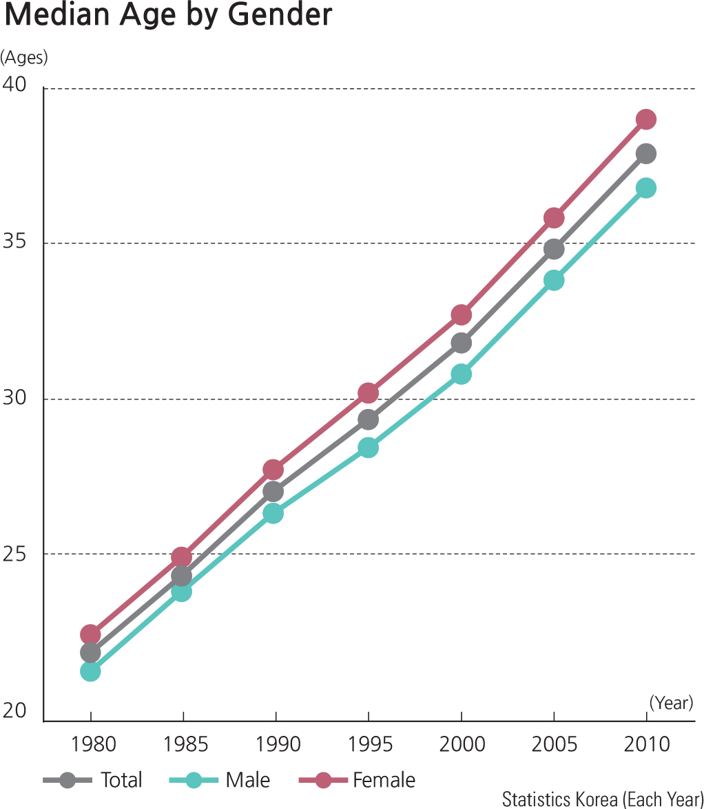
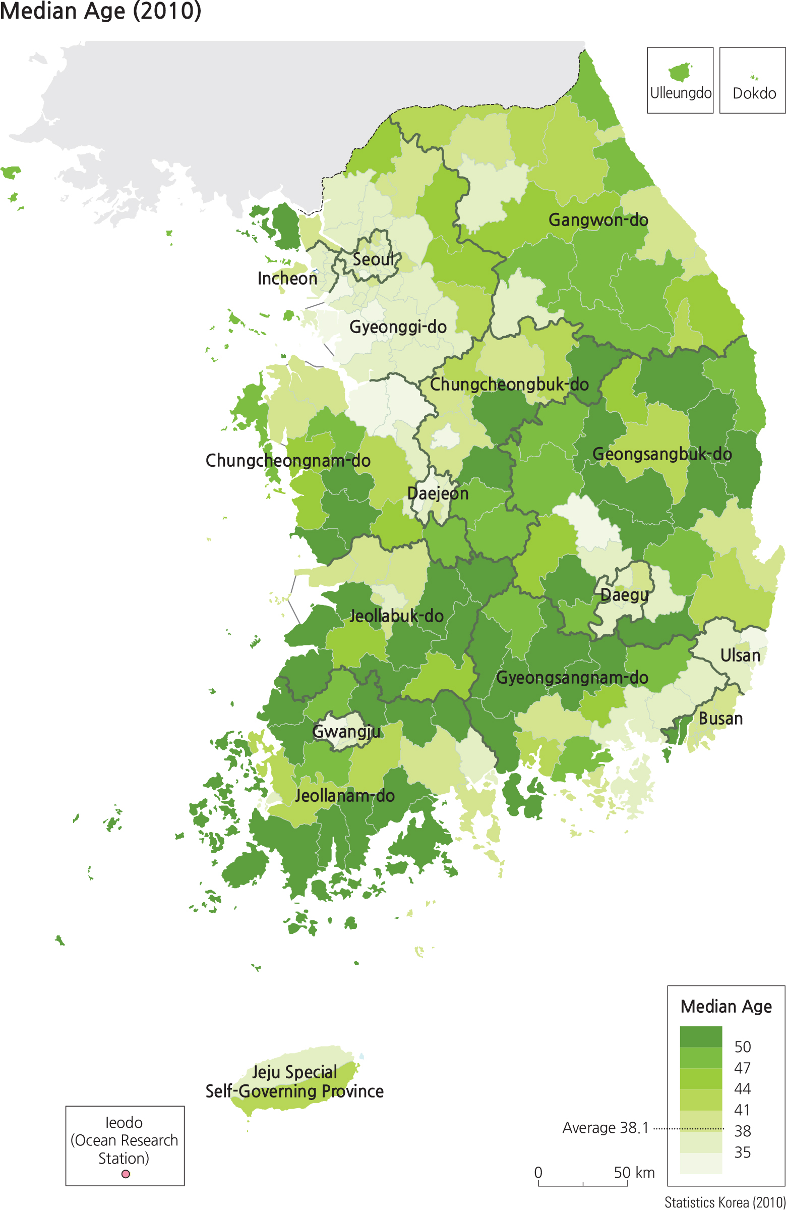
On the other hand, the high sex ratio districts appear in the areas where male workers are in demand, such as heavy manufacturing and chemical industries in Ulsan, Geoje (Gyeongsangnam-do), Gwangyang (Jeollanam-do), and the northern part of Chungcheongnam-do, where many development projects have taken place. The military border regions in Gangwon-do also show high sex ratios. In the age group including the early 30s, the sex ratio is above 100 (i.e., more males), but it drops below 100 in the population older than 50. The sex ratio drops further in the elderly group. The median age has risen continuously due to increases in average life expectancy. The median age map verifies the sex ratio map, illustrating that the median age is relatively lower in metropolitan areas and higher in gun districts.
Brief Interpretation of the Pyramid and the Maps
The population pyramid is a very useful graphic for analyzing the structure of a population. The left side of the pyramid (blue bars) represents tallies of male population by age groups while the right side represents females. The bottom bar represents infants between birth and one year old, the bar above that represents 1 to 2 year olds, and so on. In this particular pyramid depicting the population of Korea in 2010, one can immediately notice that the pyramid has a very narrow base (birth to 9 year olds) indicating that the birth rate has greatly declined compared to other age groups. There are bulges for the 28-32 age groups, meaning that the years when they were born (1978–982), there were large numbers of births. The comments on the right side of the pyramid with arrows pointing to each specific age group indicate the causes and effects that may explain the size of population for that year, perhaps due to government regulations or perhaps due to war or other historical events. Demographers and geographers routinely use population pyramids to analyze the structure of a population.
The 2010 Sex Ratio map displays the geographic pattern that highlight the spatial distribution of places that have more males or more females. The blue colors indicate places of more males and the beige and pink colors indicate places where females outnumber males. Once again, we see a prominent northeast to southwest band (primarily rural areas) that stands out to represent more female population.
The 2010 Median Age map illustrates the distribution of people of ages below or above the national average of 38.1 years old. The two shades of the lightest green colors represent young people who are under the national average of 38.1 years while the rest of the darker shades of green represent people older than the national average. In general, young people tend to be urban dwellers, concentrated
in cities of various sizes while older people live in the northeast-southwest band.
The information displayed on these two maps suggests that urban populations are younger and have a higher number of males. Suggest some reasons why this is the case and support your reasons with information shown in the population pyramid by looking into work-force age groups, school-age groups, and sex-ratio comparisons.