Like many other atlases, this National Atlas of Korea: Comprehensive Edition is mostly filled with thematic maps. As defined above, a thematic map is one that focuses on a theme; this can be a population map, a land use map, a natural resources map, or any other theme that renders geographic information. Thematic maps are created because they can tell a great deal about the spatial distribution of important social, economic, demographic, environmental, and political characteristics about an area or a nation. Visualizing the concentration or sparseness of hot spots of a thematic pattern will assist policy makers to make better decisions about these places. Thematic maps can be great decision-making tools.
The number of topics that can be mapped is unlimited so long as data are available. This is why they are so popular. With the available software programs today, it is very easy to create thematic maps, often by pressing a few buttons or with a few clicks of the mouse. However, making a good and meaningful thematic map is also a complicated process. This section is an introduction to the different kinds of thematic maps as well as an attempt to demonstrate the extensive methods and the complexities of creating thematic maps and the equally complex circumstances in their interpretation. The two principal types of thematic maps can be categorized as qualitative and quantitative.
With the current emphasis on technology and learning how to use GIS to make thematic maps in secondary school level geographic education, there are several often neglected or forgotten and yet simple questions that need to be asked in order to promote spatial understanding.
•For what reason or purpose do we make a particular map?
•How well does a map convey its geographic meaning?
•How well does a student understand the intended message of the map?
•What is the proficiency or ability of a student’s interpretation of a map given that there are so many kinds of maps and so many ways a cartographer can make it?
•How great is the effort on the part of the teacher to teach map reading, analysis, and interpretation?
Obviously, there is no simple answer to any of these questions or others that have not been specifically raised here yet. But these questions do relate to spatial thinking and spatial understanding. Map interpretation is unquestionably a key issue for the improvement of geographic education.
Since each map is unique, so is its interpretation. Some of the common, unwritten rules relate to the analysis of the logic between title, legend, scale, data, mapping method, and visual presentation. Experienced cartographers and map designers manage a symphony of all these components in the creation of a map. As a map reader, adding some common sense is almost a requirement, but the greatest asset a map reader can have is a general, or even specific, knowledge of the geography of the place being mapped. Applying the element of geographic knowledge as an aid to map interpretation can be very helpful. Several examples are provided below to illustrate this connection.
Recognition of Spatial Attributes and Patterns:
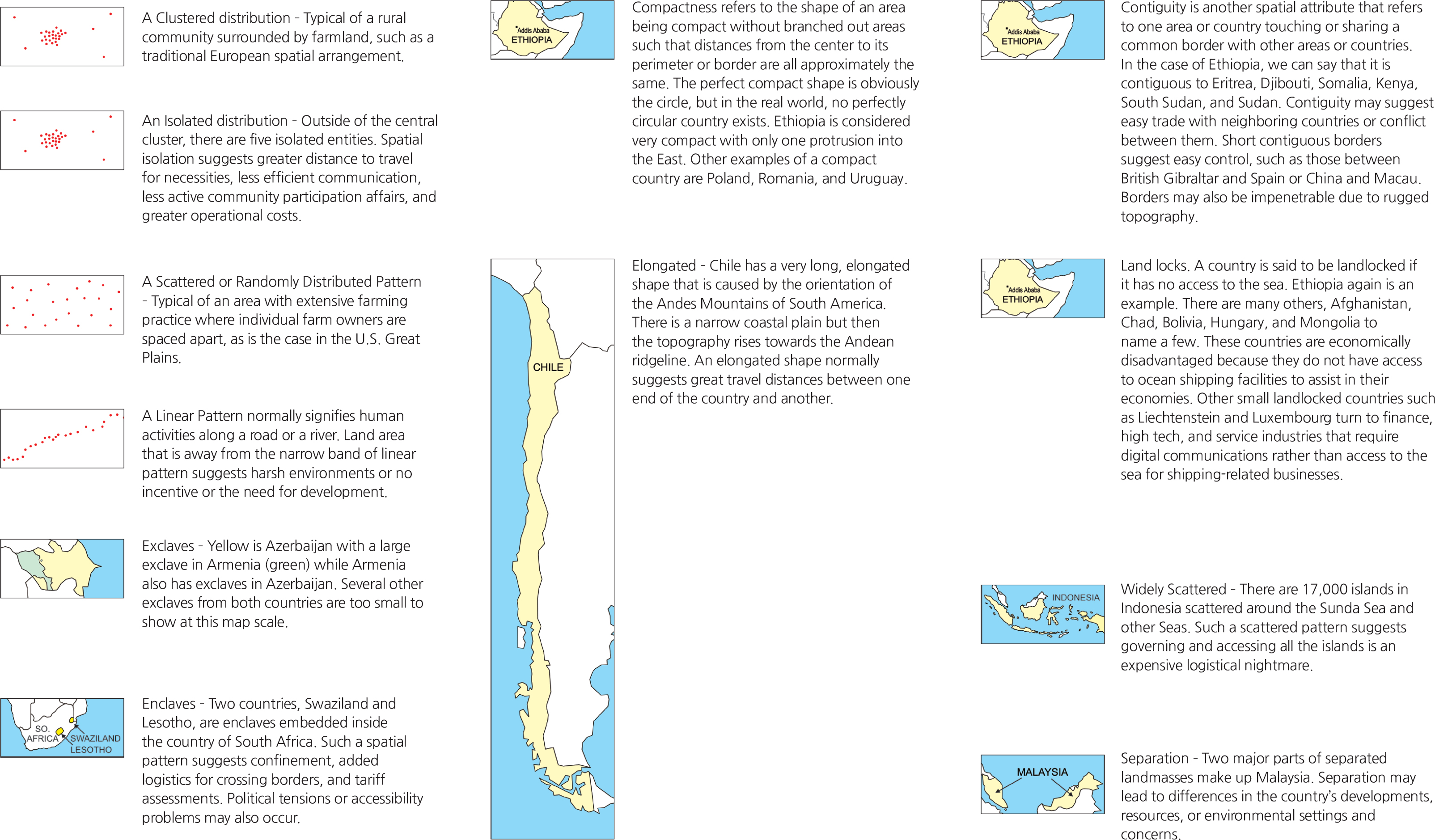
Geographic or spatial patterns provide clues to the interpretation of maps. Many real-world phenomena exhibit specific patterns that can be readily identifiable on maps. Few features in nature have straight lines or sharp corners; such occurrences are clues that these features are artificial. Railroads are always in straight lines or in gentle smooth curves rather than sharp curves or in angular turns simply because trains do not run through sharp curves. Based on our knowledge of how certain things are distributed, we can summarize some of the workings of many spatial patterns. The following are typical examples.
<drawing> A Clustered distribution
<drawing> An Isolated distribution
<drawing> A Scattered or Randomly Distributed Pattern
<drawing> A Linear Pattern normally signifies human
<drawing> Exclaves
<drawing> Enclaves
<drawing> Compactness
<drawing> Elongated
<drawing> Contiguity
<drawing> Land locks
<drawing> Widely Scattered
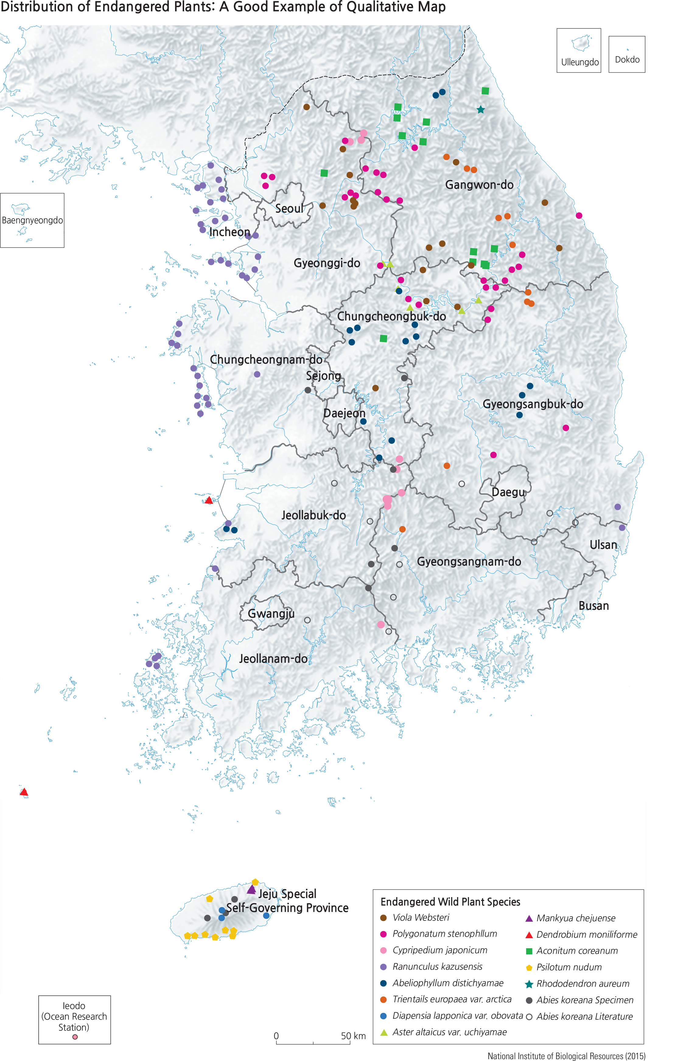
<drawing> Distribution of Endangered Plants: A Good Example of Qualitative Map
Obviously, not all possible spatial patterns can be presented here; training oneself to carefully observe what the pattern implies will undoubtedly help in spatial reasoning. In addition to spatial patterns, the matter of temporality should also be considered. Understanding a time frame’s effect on spatial arrangement can also be critical in map reading. For example, a zigzagging road with hairpin turns normally implies a steep grade that goes up a mountain; while seemingly a good access to the mountain top, the time of year may play a factor as snow may make it impassible. The same can happen with intermittent streams during alternating dry and rainy seasons. Nevertheless, using common sense in addition to spatial thinking skills will enhance map reading and interpretation success.
Qualitative thematic maps: These maps show the locations and spatial distributions of specific geographic features. Examples are planning maps, geologic maps, soils maps, transportation network maps, distribution of flora and fauna species, and so on. They are not quantitative in nature and are not meant to have a rank order of all features that are mapped. They can be very effective in showing concentrations or dispersions of a particular feature.
Interpreting qualitative maps appears to be a simple and straightforward process since no numerical data are involved. For each qualitative map, the map legend and its definition of symbols play the most important role. Matching any map symbol to the legend should always reveal what that symbol represents. But the map interpretation process goes beyond the ability to identify which symbol represents what. The map reader should visualize all members of the same symbol that appear on the map. The Distribution of Endangered Plants map is a good example of a qualitative map. Various symbols depict different endangered species on this map; the green square symbol represents Anconitum coreanum, commonly known as Korean monk’s hood. Spatial questions can easily be raised about the location of Korean monk’s hood. That leads to inquiry which subsequently may lead to possible answers. Is the distribution of Korean monk’s hood showing a distinct pattern such as linear, scattered, clustered, or skewed in one direction and not another? A map reader can easily identify them on this map and come to the conclusion that they are somewhat clustered in remote high mountain places. The power of spatial reasoning is what leads to further understanding of the geography of the land.
Quantitative thematic maps: Quantitative thematic maps are based on the concept of treating the surface of the earth as having statistical data points, or a statistical surface. All point locations on the surface of the earth can be described (or located) by latitude and longitude (x and y values in a two-dimensional coordinate system). It is also true that any point location on land that is above sea level has an elevation; the elevation of a point is considered as the third dimension or designated as a z-value. Besides elevations, there are many other data that can be mapped with z-values, such as amount of rainfall as measured by the locations of rain gauges. If there are instruments to measure carbon dioxide concentrations, one can literally collect data points of carbon dioxide concentration at every street intersection in a city and they will create a statistical surface of carbon dioxide for that city. Thus, we can proceed to map a pattern of carbon dioxide concentrations for that city by using modeling methods. Statistical surfaces are as wide as all the instruments that take measurements of any attribute, or censuses and surveys conducted over an area. Thus, quantitative thematic maps are as wide as our data collection techniques allow for gathering spatial information.
The discussions of quantitative thematic maps begin with the least common and least used mapping method called “dasymetric maps,” followed by a common method called “isarithmic maps,” and then by a widely used method of “dot maps and graduated symbol maps,” and finally the most popular thematic mapping method called “choropleth maps,” which warrants a lot of in-depth explanation.
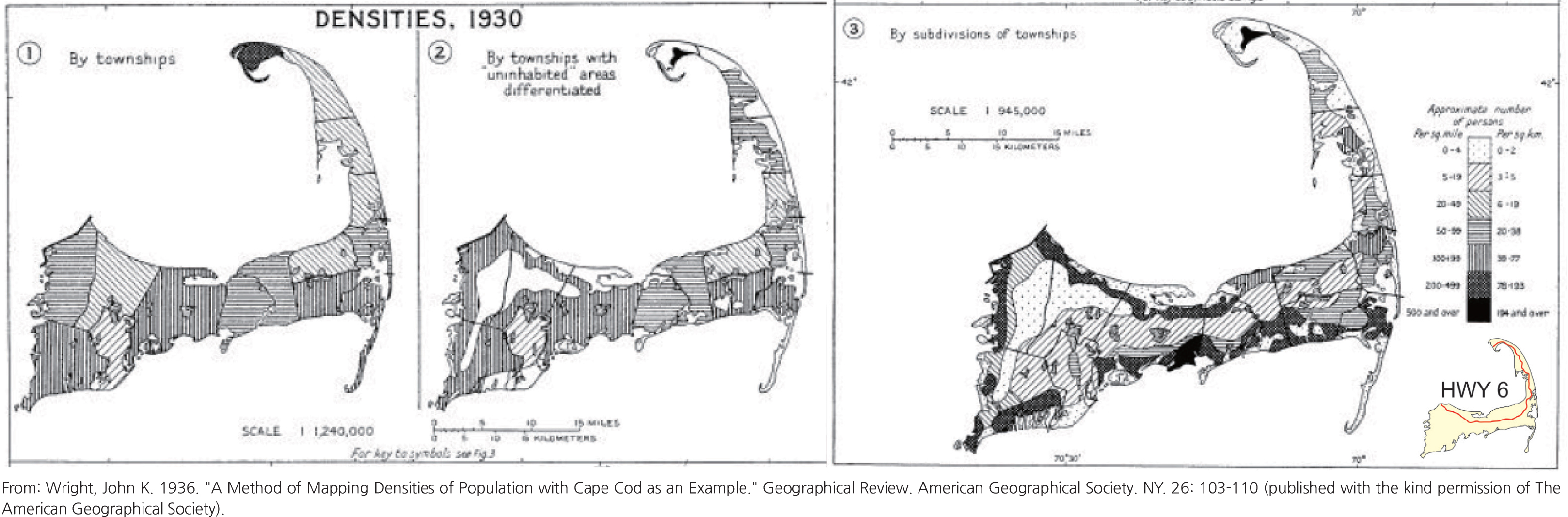
•Dasymetric maps: The dasymetric mapping method is a rarely used mapping method because it is unconventional and requires ancillary spatial information such as other supporting maps to help determine if the use of this method is valid. The classic example is John K. Wright’s Cape Cod: Population Maps. He first mapped population density by townships (left map below); then he mapped the uninhabitable areas of Cape Cod (center map) because of their absence of population. Then he combined these two sets of data and recalculated population density based on subdivisions of townships, a finer mapping area unit. This resulted in the dasymetric map (right map), which is a much more accurate representation of Cape Cod’s true geography of its population density that also correlates to the density of homes along the coastal lines and the commercial businesses along Highway 6 that runs in the middle of the curved peninsula.
Recent computer programs have been written to facilitate such calculations that are meant to combine more than one map into the making of daysmetric maps; the U.S.G.S. has produced some accurate maps of the San Francisco Bay Area population density based on this method (USGS, 2017).
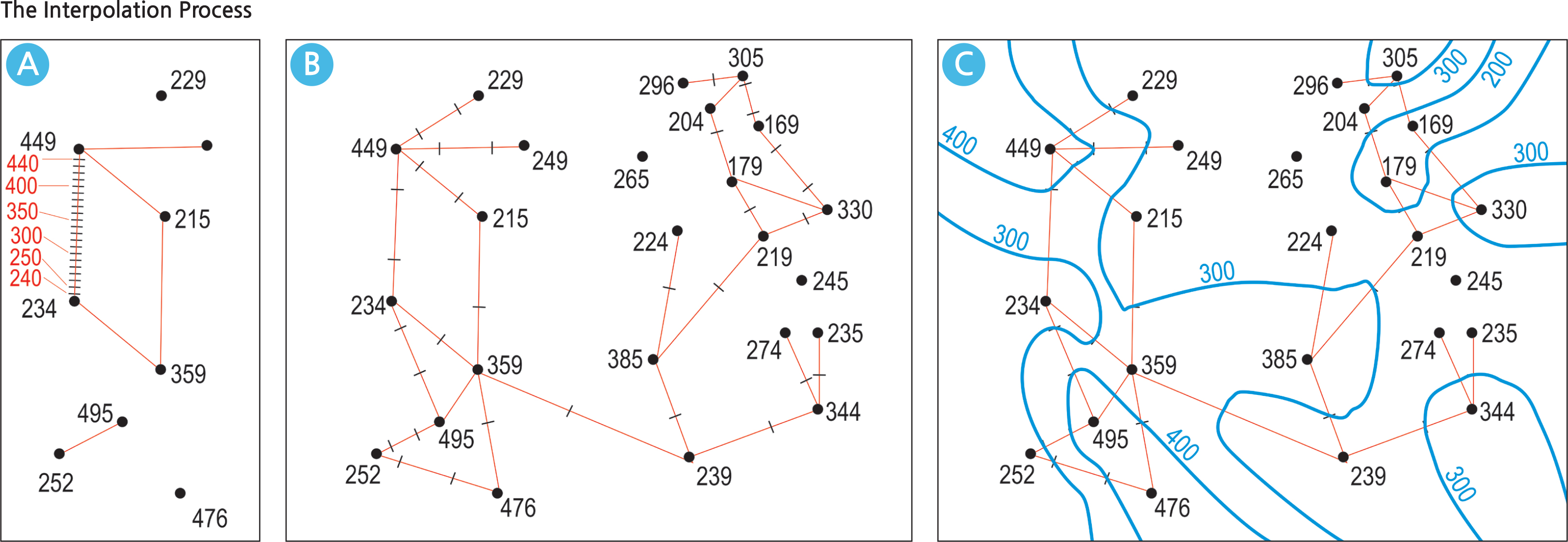
• Isarithmic maps: The term “isarithm” refers to a line that connects all data points of the same value. For example, a contour line joins all points of the same elevation; an isohyet joins all points of equal rainfall; an isobar joins all points of equal air pressure. There are two types of isarithmic maps: the isoline map and the isopleth (or isoplethic) map. The contours, isohyets, and isobars are typical isoline maps since they represent real physical data surfaces, but there are many others –any set of point data relating to the same attribute (say, housing values) can be mapped by isolines. Isolines are generated with the process of interpolation.
The Interpolation Process
Interpolation begins with a set of existing data points in two-dimensional space. Each data point has a spatial relationship with each other data point, however many there may be. The red lines on Map A (below) of the Interpolation Process show such spatial relationships. Between the points with values of 234 and 449 is a line with a proportionally graduated scale of equal parts; the values 300 and 400 fall on this line and the tic marks for 300 and 400 indicate where the isoline with those values will pass through. This is the interpolation process. Map B shows all the data points that are linked with either or both the 300 or 400 values: their tic marks are also indicated. Map C follows with the actual model that the blue isolines are generated through with these tic marks.
<drawing> DENSITIES, 1930
<drawing> The Interpolation Process
<drawing> Values are in thousands of dollars
A major characteristic of the isoline map is that it represents a continuous surface where any data point in between two isolines can be interpolated with a relatively high degree of accuracy. Unlike the contour representation of land elevation, isopleth maps employ the same technique of generating isolines; however, the value in between isolines cannot be precisely determined. In such a case, an average or interval value can apply.
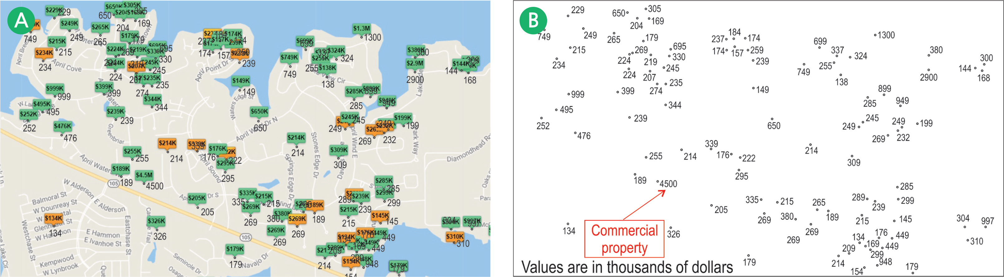
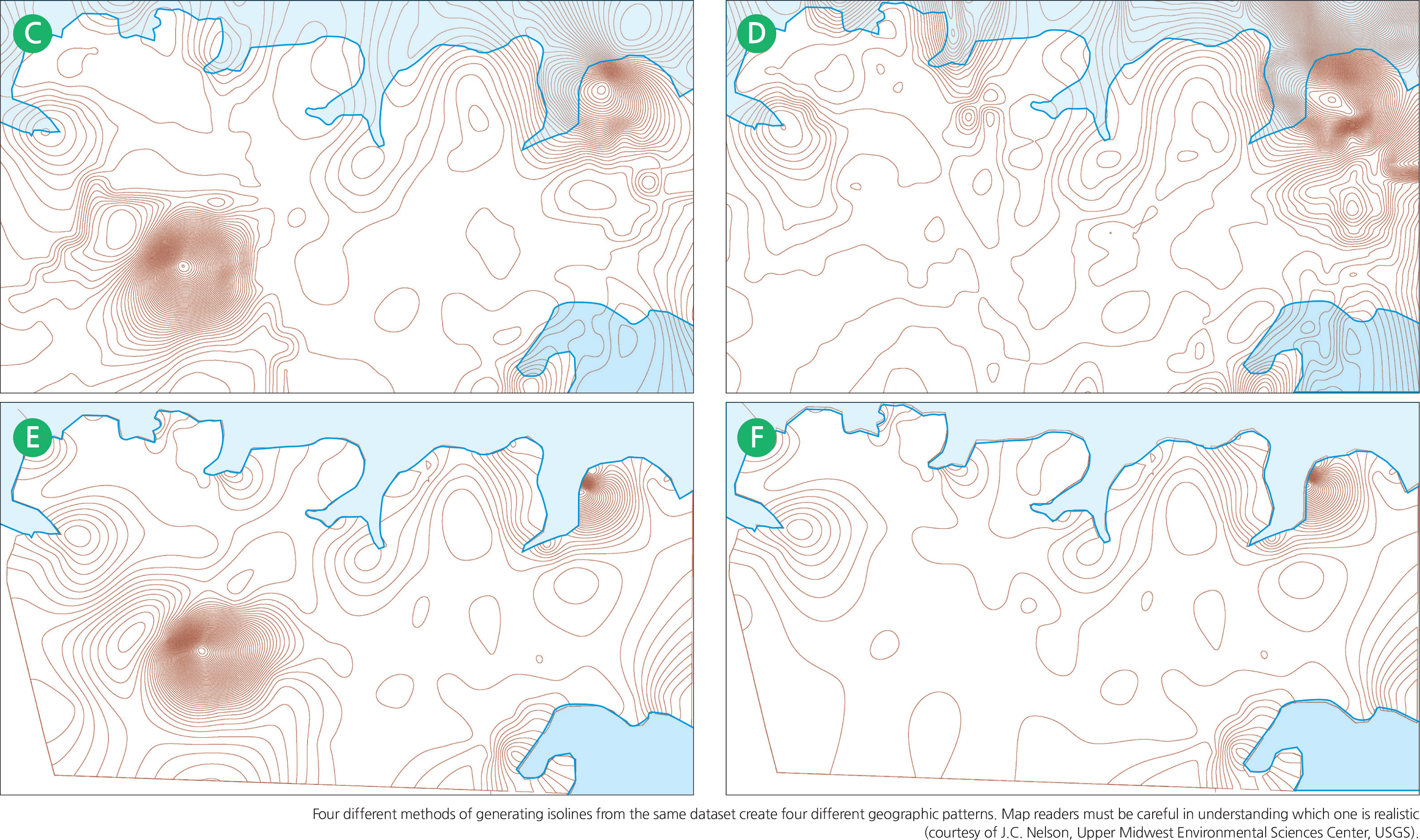
Map A below is an actual map from a real estate website depicting properties that were listed for sale in the City of Montgomery, Texas on the shore of Lake Conroe. Each house lists a specific asking price in thousands of dollars. The individual data points are re-drawn on Map B thus showing a statistical surface, but with one data point for a commercial property listing at $4.5 million. Four isoline maps depicting house prices are generated using the “spline interpolation” method, each with a different parameter. It is apparent that all four have different patterns.
The isolines for Maps C and D were generated with a default computer routine without regard to the geographic reality that the shoreline is there. The routine assumes the extensions of the isolines over the lake. Map C also included the presence of the commercial property, which definitely skews the real estate asking price pattern. This data for this property was deleted to generate only the residential properties for Map D. The isolines Maps E and F were generated by using the shoreline as a barrier such that no isoline will cross over the shoreline into the lake area where there is actually no data point. The resulting maps are more realistic. The data point for the commercial property on Map E was purposely left remaining just to show how one data point can skew the entire isoline pattern. Map E is the ideal one for this dataset since both the shoreline barrier is applied and the commercial property deleted.
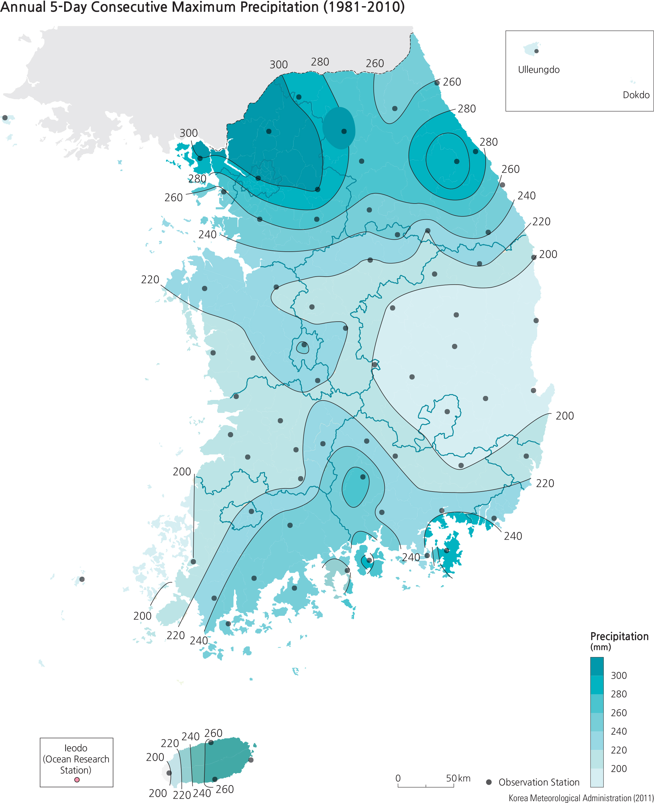
<drawing> Annual 5-Day Consecutive Maximum Precipitation (1981–2010)
Unlike the isoline map, an isopleth map is used to show a dataset that cannot be assumed to be continuous. The Annual 5-Day Consecutive Maximum Precipitation Map (1981–010) inserted from p.138 of The National Atlas of Korea II is an example of an isopleth map (left). Unlike the isoline map, precipitation values cannot be considered continuous. In other words, a map reader cannot perform interpolation procedures in-between the isolines and expect the in-between points to be proportional to the distance between two isolines. For example, a point situated exactly midway in a perpendicular distance between 220 mm and 240 mm isohyets does not necessarily represent 230 mm. The shaded colors are used in an isopleth map to convey the fact that a map reader can only assume the inbetween values to be in the range of 220–40, not a precise precipitation value.
Example of an isopleth map depicting the precipitation pattern of South Korea (courtesy of The National Atlas of Korea II, page 138, published by the Korean National Geographic Information Institute.)
• Dot maps and graduated symbol maps: A dot map is a simple and easily comprehensible statistical map that depicts the distribution of a certain population. A graduated symbol map is also an easily comprehensible map that uses the proper scaling of the size of a statistical symbol to represent the data.
In a dot map, the cartographer selects what is being considered as an “appropriate” value of the population data (e.g., each dot represents 200 persons). So, for a place that has a population of 1,000,000 persons, the map will show 5,000 dots. But if the cartographer selects 250 as the appropriate value that each dot represents, there will then be 4,000 dots. Subsequently, a value of 1,000 will yield 1,000 dots and a value of 100 will yield 10,000 dots on the map. There is no right or wrong way for selecting any one of these values: 100, 200, 250, and 1,000. However, what makes the dot map easily comprehensible are several other factors that the cartographer must consider. The physical dimension of the map itself, the size of the dot symbol, and the pattern of concentration of the data will all contribute to how a dot map looks or how easily it can be interpreted. A smaller page size or map dimension will warrant the cartographer to consider a higher value for each dot so that the total number of dots is at 1,000, but the map will suffer in dot placement accuracy. A larger dimension can afford more map space to accommodate more dots so that the cartographer may select 200 as the dot value, which would yield 5,000 dots, thereby increasing the accuracy of dot placement and contributing to a more accurate population pattern.
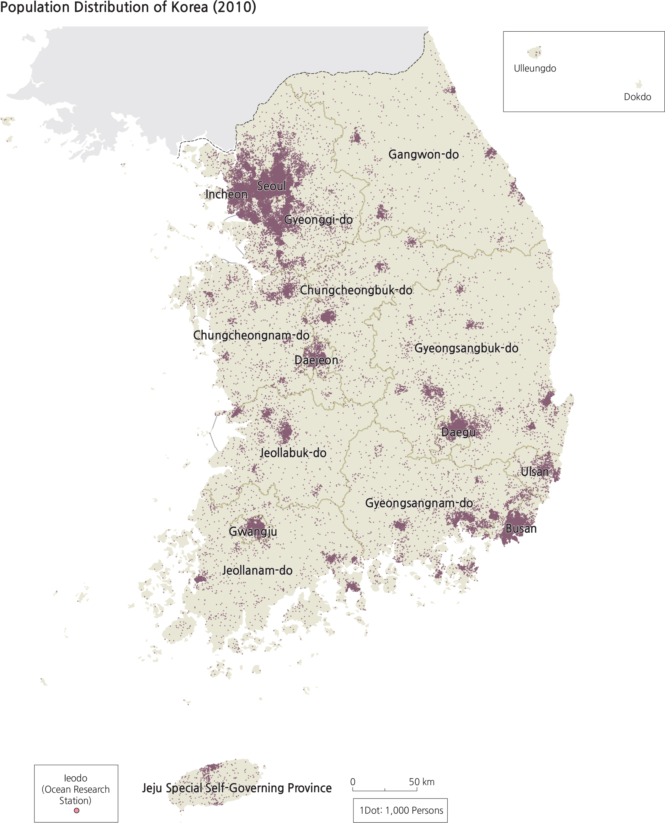
<drawing> Population Distribution of Korea (2010)
While the average map reader may not realize how the dot map was created, the cartographer certainly carries a great deal of responsibility in making the best selections and decisions. Sound decisions present the dot map with its best chance to communicate an accurate geographic pattern of population to the map reader. There is yet another level of difficulty for making a dot map, which relates to the placement of the dots. Suppose the dot value on a dot map is 1,000 people. As small as the size of one dot symbol may be, it is highly unlikely that all 1,000 persons live in a space at the placement of one dot, let alone all the dots in the entire map. In order to be accurate, the cartographer must have detailed knowledge of the area being mapped into dots and needs to exercise sound judgment to place the one dot in the centroid (center of gravity) of the clustered location of those 1,000 persons that the dot represents. Map readers need to understand this. While the production of the dot map is straight forward, the amount of research required to accurately place the dots in their proper locations can be tremendous and time-consuming. This is one reason why there are far less thematic maps portrayed as dot maps than other kinds of mapping methods.
A map design element comes into play here: the selection of the size of each dot symbol. Dot density will look very differently on the same map simply by changing the size of the dots, as hundreds or thousands of dots may appear on a map. If the dot size is too small, it may not convey a desirable “look” for the density. If the dot size is too large, dots may coalesce and impede the visual process and give the reader a false mental perception of the true density.
The ultimate goal here is to convey a realistically portrayed geographic pattern of the population data that has been collected with a great deal of resources and effort. Theoretically, a map reader can count the number of dots in an area and multiply by the value each dot represents to derive the total population on the map; this is highly impractical and improbable as it is such a tedious chore.
<drawing> Different Ways of Representing the Same Set of Population Data on Dot
Maps
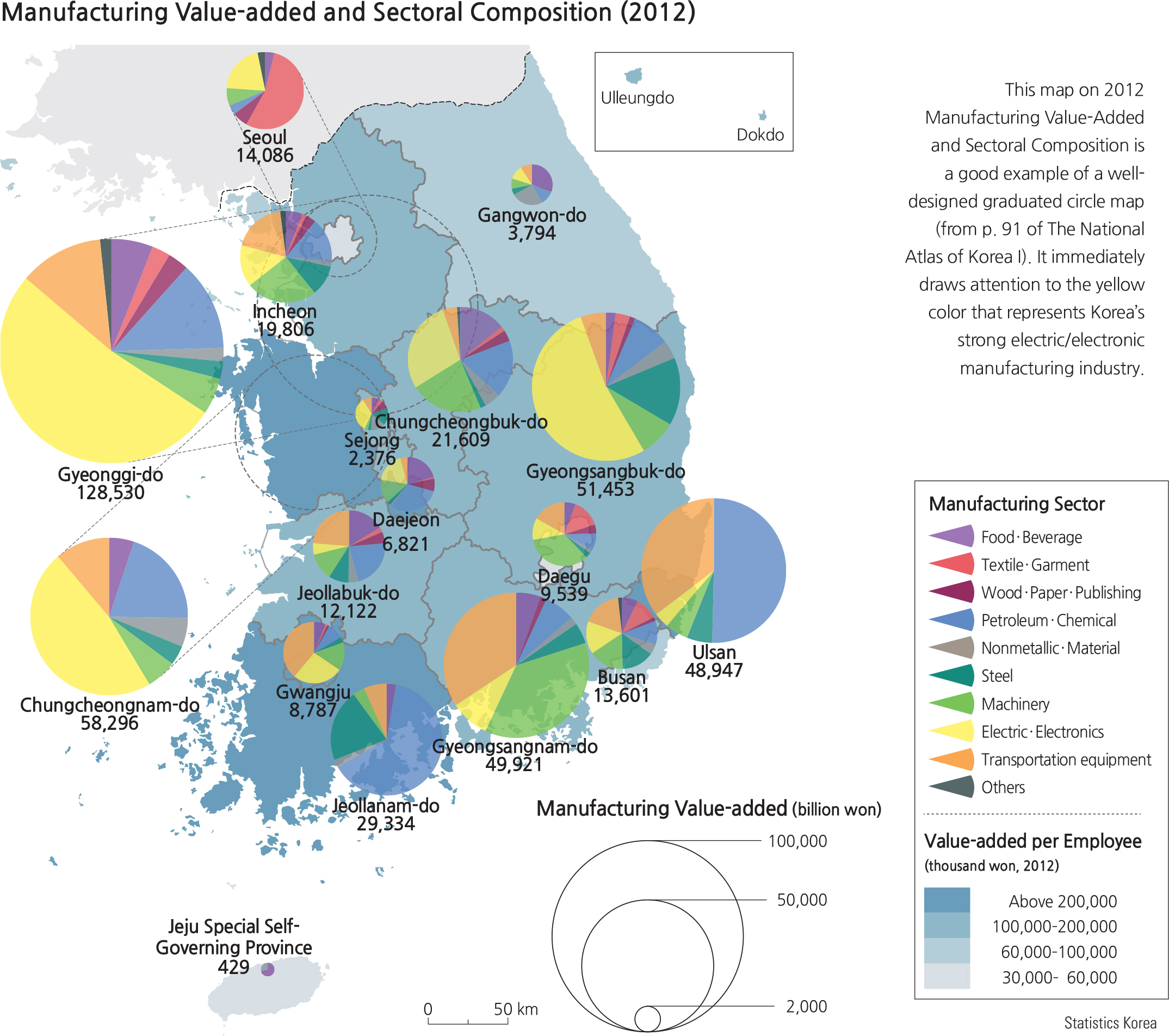
<drawing> Manufacturing Value-added and Sectoral Composition (2012)
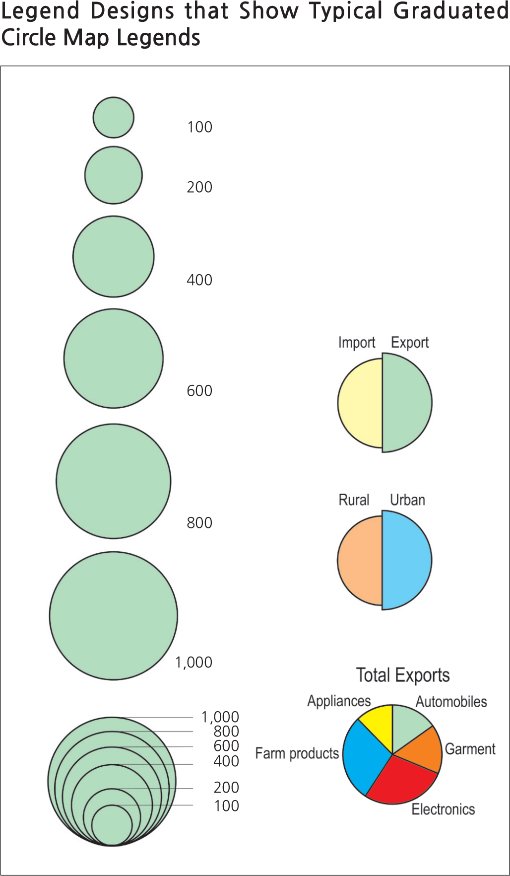
<graph> Legend Designs that Show Typical Graduated Circle Map Legends
The value of a dot map, when mapped properly, can show effectively the concentrations and sparseness of the population data over a geographic space.
The graduated symbol map is a variation of the dot map where the location of the symbol, sized to reflect the magnitude of the data, is a more detailed but less cluttered method of showing a set of spatial statistics. The symbol, normally a circle, is sized by the area of the symbol to represent a set scale of the data points. The tricky part about the construction of the circle sizes is that people often tend to forget that visualizing area is the main concern and since the area of a circle (A) is equal to πr2, the radius of the circle is then √A/π. The mistake of not taking the square root of (A/π) as the radius of the circle has been known to occur frequently on published maps; this causes an improper size representation of the data. The map reader should always be aware of this kind of mistake when viewing a graduated symbol map.
Further breakdowns of a total population data subset (such as different ethnic groups that make up 100% of a population) can be achieved with the graduated circle method. Circles can be proportionally sectored to represent the data subset based on the degrees of a circle that represent a percentage (360 degrees represents 100%). In this respect, more than one variable can be shown simultaneously on the same graduated circle map. A map with more than one variable is called a bivariate map; maps with more than two variables are considered multivariate maps. However, the more variables a cartographer includes on one map, the more difficult it becomes to interpret and derive a geographic pattern.
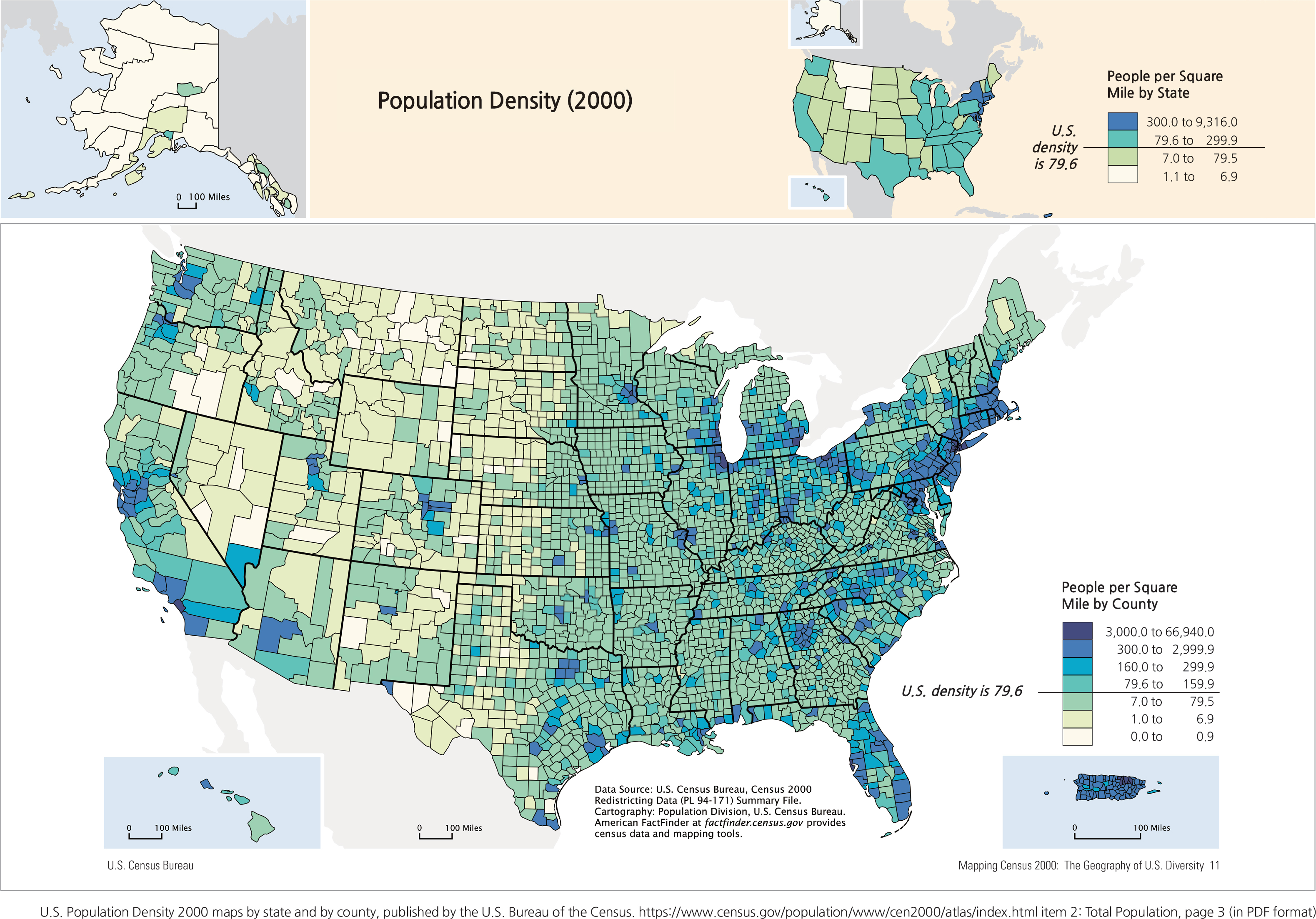
• Choropleth maps: A choropleth map is a statistical map where data collection is based on pre-established area units, cartographically referred to as mapping units. These units have pre-established boundaries, such as a state, county, province, census block, or school district. Data are collected on attributes (such as population, housing units) to cover the entirety of the mapping unit. In other words, a population tally for one county will include every person who lives within that county’s boundaries, no matter which part of the county. The U.S. Population 2000 map shows two maps of population of the United States: one based on state boundaries (upper right) and the other on county boundaries (main map).
<drawing> Population Density (2000)
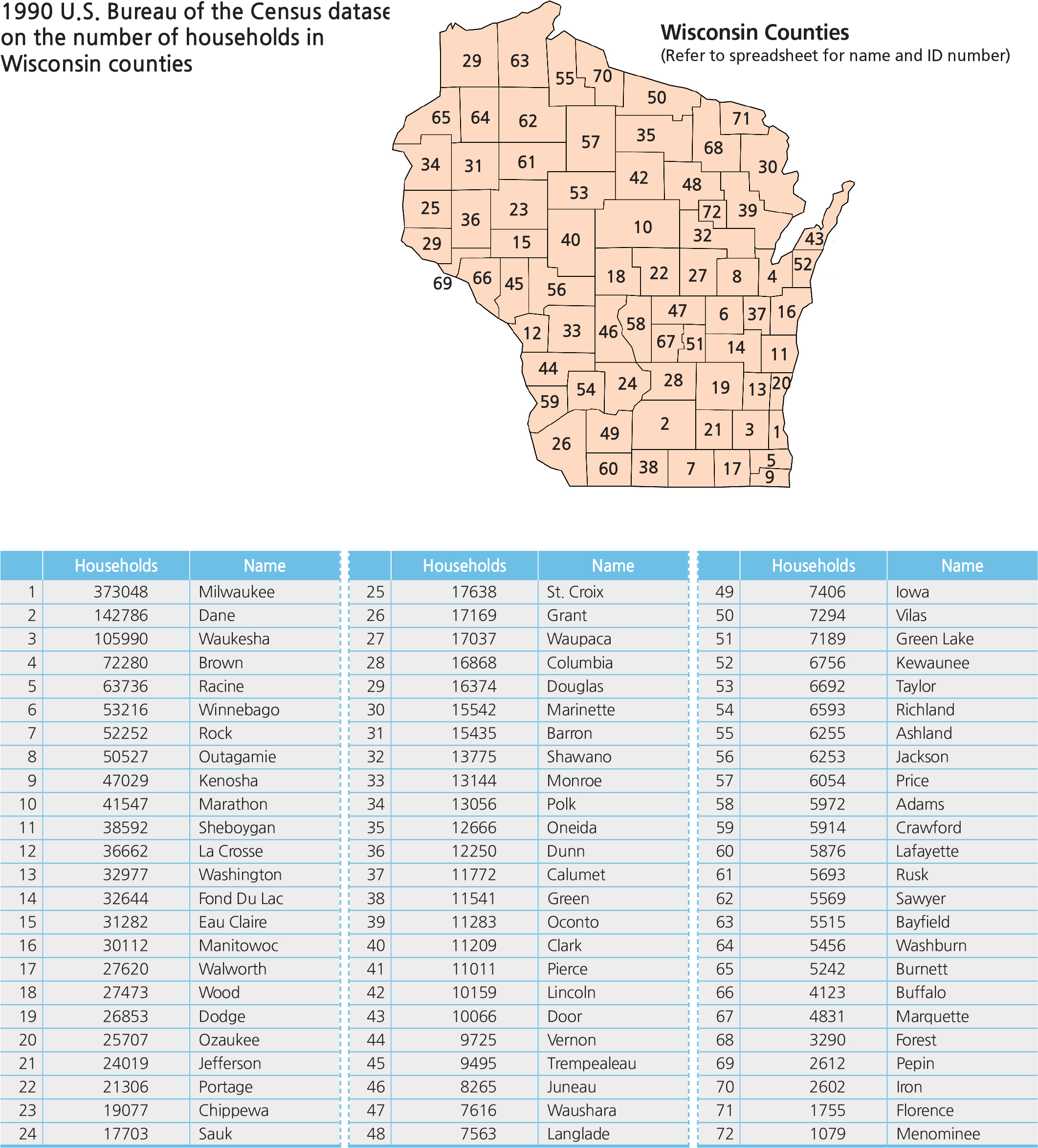
<drawing> 1990 U.S. Bureau of the Census dataset on the number of households in
Wisconsin counties
<table> Households
There are striking differences between these two maps even though they are created from the same government agency. The upper map was mapped by state statistics; the pattern shows concentrations of population density of the U.S. by states. Because the choropleth mapping method includes every single person within one state, it is not effective in showing any population density variations within that state; the best that a map reader can do is conclude that the eastern half of the United States has a higher population density. Not many other conclusions about this map can be made.
The lower map, which was mapped by county level statistics, shows population density by the counties. It is definitely a better representation than the map based on states because it shows greater detail in the variations of population density pattern for the entire U.S. For example, the spatial variations of population in the State of Texas clearly shows the high densities around urban counties near Houston, and the counties that make up the urban corridor from San Antonio through Austin to San Marcos to Waco and then the Dallas-Fort Worth areas. Western Texas is correctly shown as a low-density area with sporadic small urban counties around the cities of Lubbock and Amarillo. This rendition of population density is much more accurate than the map shown by state boundaries because the mapping unit here, counties, is smaller than states. Obviously, the collection of data for smaller mapping units requires a much greater effort, but can be rewarded with a map of greater accuracy. Theoretically, since the U.S. Bureau of the Census collects data by census enumeration blocks, a choropleth map based on mapping population or population density by census enumeration blocks −a much smaller mapping unit than the county −can yield a map with even higher accuracy. Practically, this is not a good idea simply because the census enumeration blocks will be so small on the map that any color fill may not be visible.
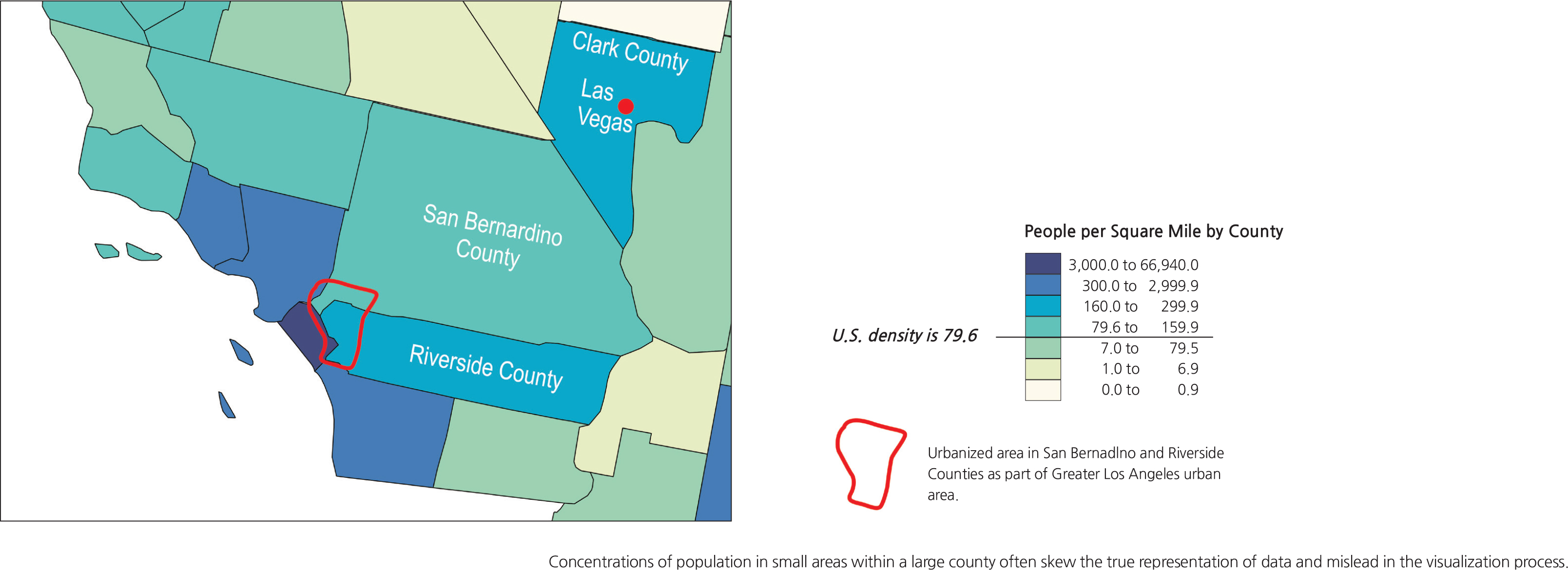
A special caveat needs to be raised here relating to a situation where population is very concentrated in a small area within a large county (or mapping unit). Consider the real population distributions in Clark County, Nevada, and San Bernardino and Riverside Counties in California. The map of population density in these counties does not reflect their true geographies. The majority of population in Clark County lives only in Las Vegas and its suburbs. The landscape outside the Las Vegas urbanized area is practically barren but yet the entire county is shown in the blue shade that represents 160-299.9 people per square mile. If not for the presence of Las Vegas, Clark County would probably be classified as the light yellow, 0.0-0.9 persons per square mile. The vast stretch of land in San Bernardino County is also basically devoid of population and includes the Mojave Desert. But the shape of the County protrudes into the Greater Los Angeles urban area. The very small urbanized area in the southwest corner of San Bernardino County contributes to a high overall population density of 79.6-159.9 people per square mile, even though the dark green color paints over the remaining 95% of the entire land area in the county, including the Mojave Desert. The same case is true for Riverside County.
In addition to the effects of the size of the mapping unit, the choropleth mapping method can also be very complicated in other ways, particularly in the data handling phase of making the map and the visualization phase by the map reader. There are many statistical methods for the cartographer to classify data and determine the best way to handle a particular set of data. Some of the common methods are:
• Equal intervals
• Quartiles, quintiles, sextiles, septiles, etc.
• Natural breaks in dataset
• Targeted breaks in dataset
• Parameters of a normal distribution (e.g., classification by standard deviations)
• The Jenks’ method of Goodness of Variance of Fit (Jenks 1967)
• Arithmetic progression
• Geometric progression
• And many more
Once again, important decisions must be made by the cartographer because each one of these methods can be multiplied into several renditions of the choropleth map by varying the number of classes used and the statistical method selected. Consider the following dataset obtained from the U.S. Bureau of the Census for its 1990 Census. It shows the number of households in each county in the State of Wisconsin in 1990. This spreadsheet has been sorted from the highest number of households to the lowest number in each county. Milwaukee County (373,048), Dane County (142,786), and Waukesha County (105,990) have far more households than each of the rest of the counties. In fact, there is a large difference between the highest counties and the lowest counties (28 counties with less than 10,000 each) that makes this dataset difficult to map.
To demonstrate how this dataset can be mapped from dozens of statistical methods to create different versions of maps with the same set of data, nine maps are created. They all look different. The immediate question anyone will raise is “which one is correct?” The answer is: all of them are neither correct nor incorrect. The map that best simulates the true geography of the land is the best map and producing it is the responsibility of the cartographer. With the widespread access to GIS and other mapping software, making maps has been said to be democratized. Everyone is equally capable of producing thematic maps or freely disseminating them on the Internet, but not everyone has received the vigorous training that a professional cartographer has. This is why students and teachers alike should learn to be skeptical and keep a critical eye over the quality and integrity of the map that has been presented.
Maps 1, 2, and 3 are created with the most frequently used equal intervals method (e.g., 0–00, 100–00, 200–00, and so on) by dividing the highest data value by the number of intervals, 4, 5, and 6 in these cases. In Map 1, dividing Milwaukee County’s 373,048 by 4 yields 93,262 which becomes the range to set the interval sizes (0–3,262, add another 93,262 to make 93,262–86,524 and repeating this to make 186,524–79,786, and finally 279,786–73,048). The same is repeated for Map 2 by dividing 373,048 into 5 classes and Map 3 into 6 classes. Because the dataset is skewed at the top, the equal intervals mapping method did not produce any truly representative patterns on the maps since there are no data points in the middle ranges, thus resulting in mostly the yellow lower-level class intervals and no in-between shades of green. Thus, the equal intervals method is not appropriate for this particular dataset.
Maps 4, 5, and 6 use a different statistical approach. The quartiles method divides the total number of data points, in this case 72 counties, into 4 groups with 18 data points each (5 groups for quintiles, each with 14.4 or rounded to 14 data points per group, and 7 groups for septiles, each with 10.3 or rounded to 10 data points per group). The resulting maps show a lot more diverse patterns than the equal intervals method. Although having more diverse patterns on these three maps, they still have not achieved the true geography of the distribution. Even with the septiles method, the seven class intervals are still unable to clearly show the skewed concentration of the top counties when Milwaukee County (373,048) is included in the same interval as Marathon County (41,547).
Maps 7, 8, and 9 make use of natural and targeted breaks in the dataset. A break is a large jump in value from one data point to the next in the dataset. Examining the top values in the dataset quickly reveals that there are big jumps from Brown County (72,280) to Waukesha County (105,990) to Dane County (142,786) to Milwaukee County (373,048). Map 7 shows a 5-interval map delineated with natural breaks between 72,280 and 105,990; 32,997 and 36,662; 13,775 and 15,542; and finally, 7,617 and 8,265. This method is an improvement over the quartile, quantile, and septiles methods; it clearly separates the top three counties from the rest.
The natural breaks method is closely associated with the Jenks’ Goodness of Variance of Fit statistical modeling of a dataset. Natural breaks are obvious boundaries for delineating interval thresholds in a dataset. As the breaks separate groups of data points, the mean of each group can be calculated and the furthest data points away from the mean would have the greatest variance, while the data points near the mean would have the least variance. It is most desirable to have groups that compute to the lowest variance index which ranges from 0 to 1. An index number closest to 1 has the lowest variance and the best goodness of fit for the classified groups. The statistical formula for the Jenks Goodness of Variance of Fit method is embedded in most current choropleth mapping software programs’ classification routines; it should be applied whenever available.
Maps 8 and 9 are targeted approaches to the natural breaks, with 5 and 7 classes, respectively. Map 8 classifies the top three counties into one class and the rest with arbitrary breaks. The result is a good representation of the realistic geography of households in Wisconsin counties.
<drawing> Nine of the dozens of methods that can be used to create choropleth
maps to show the number of households in Wisconsin counties in 1990.
Map 9 goes one step further into 7 classes, with Milwaukee County separated above all others since there is a big jump in the data; isolating Milwaukee County to stand out as having the single most number of households by far is certainly justifiable. Having Dane County and Wakesha County included in the second highest class also separates these two counties from the rest of the counties. Since the top three counties are now classified, the remaining data points are no longer greatly skewed and can be logically grouped into 5 more classes with much less variance.
In these respects, Map 9 with its 7 classes is the best representation of a much-skewed dataset. One might suggest that adding more classes will further improve the accuracy of the map; theoretically, it is true, but by adding more classes, the cartographer runs into a map design problem of finding enough variations of tints to show the classes. Psychologically, it is difficult for a person to see and recognize 8 different shades in the grey scale. It would be counter-productive for a cartographer to design a map that has more than 8 different shades of the same color. This is where cartographic theory intersects with the practicality of map design when the cartographer has to decide how to manage both competing parameters. The map with too many shades creates difficulty for the map readers to visualize the data and distinguish between all the different shades, particularly with small area units filled with a medium shade.