Comprehensive Edition 2022
An artist faced with a blank canvas has many decisions to make regarding subject matter, scale, color palette, composition, line thickness, perspective, and framing. Each choice reflects what the artist feels about the subject and what ultimately will be conveyed to the viewer. In creating a map, a cartographer has a similar array of decisions to make about composition, perspective, color, and scale.
When interpreting the maps in this atlas, it is useful to be aware of how such choices can affect the presentation of the data. Different presentations of spatial data can have a large influence on the effectiveness and clarity of a map. One of the most important choices a cartographer makes is the choice of a map projection.
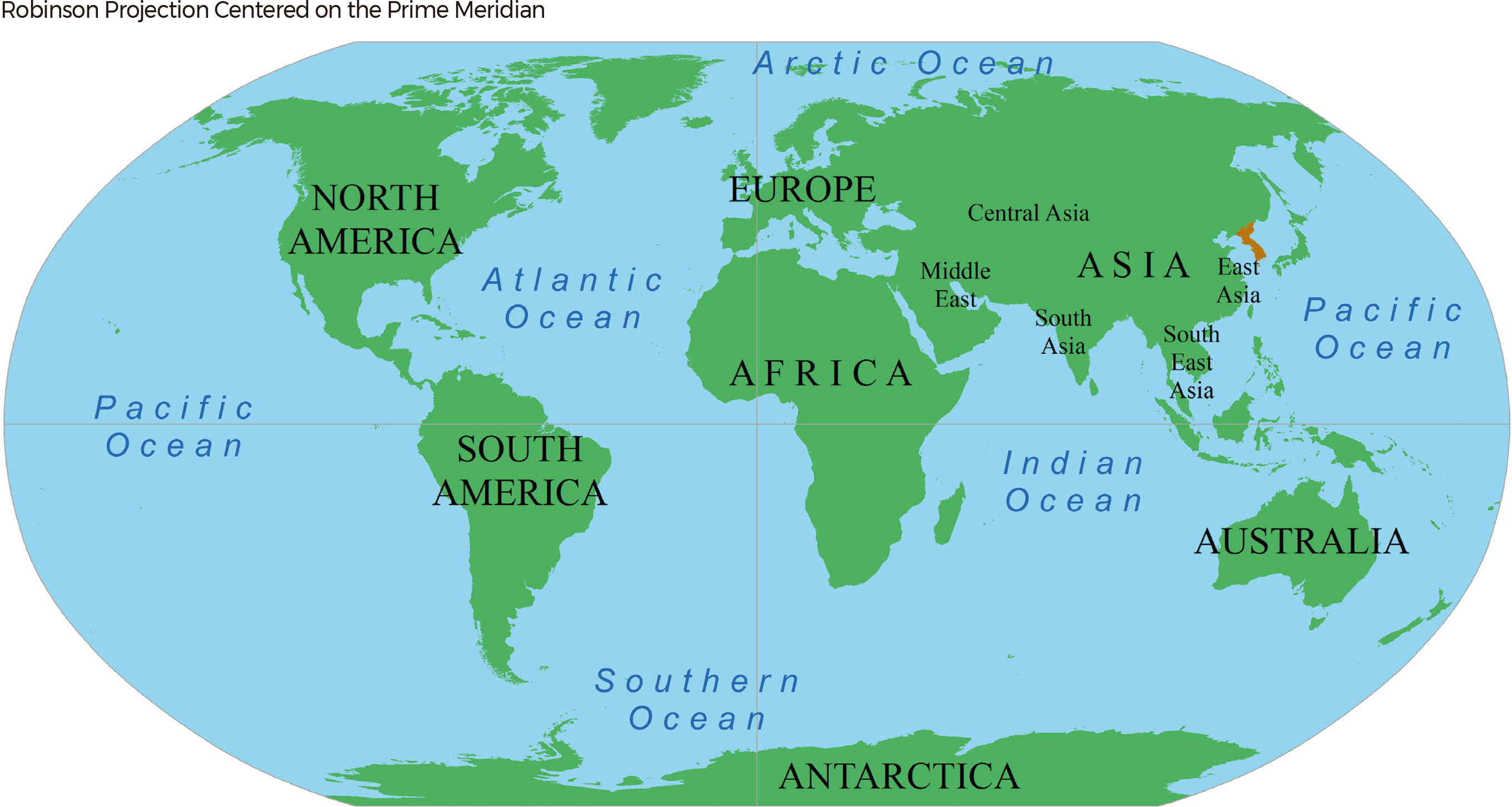
Just as there are different ways to create an artistic work using different media, there are many ways to paint a picture with maps. The maps on this page present a portrait of Korea (shown in red) in its global context. The way geographic features are shaped and arranged on a map is called a map projection. The map below uses what is called the Robinson projection, which is commonly used to show all of the continents.
Of course, the real Earth is sphere-shaped, like a ball, so that when a cartographer draws continents on a flat page, their shapes are slightly distorted. The Goode projection (above) is one way to reduce the distortion of the area of continents. It looks like an orange peel, so it’s a good reminder that the map represents the surface of a sphere. You can almost imagine putting the peel back into a sphere shape, reattaching the edges of the Pacific.
Both of these maps put the prime meridian, running through Europe and West Africa, at the center of the map. These projections make it look like Europe and West Africa are at the center of the world and that Korea is off to the side, far from the Americas. A person reading these maps might picture Korea being away from the center of activity or remote. The heart-shaped projection below, on the other hand, emphasizes the Pacific Rim, the edge of the Pacific Ocean that borders the Americas, the eastern coasts of Asia, Australia, and the islands of Oceania. Since Korea lies on the Pacific Rim, this arrangement shows Korea in a more central position and makes it easy to see how ships can go from Korea directly across the Pacific to reach other points on the Pacific Rim. It also shows how close Korea is to other parts of Asia.
The azimuthal equidistant projection shown below at right places Seoul, the capital of South Korea, at the center of the map. This projection distorts the shapes and areas of continents. For example, South America is stretched out in a big arc across the top and right of the map. But the projection is helpful for showing the correct direction (azimuth) and distance from the center point to other places on the map. For example, the shortest route for a plane going from Seoul to New York, 11,000 km away, is to fly over the Arctic Ocean. |